Who it's for
Ops, management, finance, and service teams drowning in data. Carriers, SaaS products, and service orgs where reporting exists but the morning scan still happens in a spreadsheet - or every role sees the same cluttered screen.

Dashboard design
Operational dashboards and SaaS admin panels where exceptions, roles, and next actions come before equal-weight charts.
Ops, management, finance, and service teams drowning in data. Carriers, SaaS products, and service orgs where reporting exists but the morning scan still happens in a spreadsheet - or every role sees the same cluttered screen.
Custom dashboard design and development. Operational dashboards, admin panels, and reporting views with clear hierarchy, role-based filters, data visualization, and integration with CRMs, ERPs, APIs, and databases you already run.
Scattered data, weak signals, spreadsheet workarounds. When charts compete for attention, filters don't reach the right records, or exports replace action - we map the decision first, then design the view that moves users from information to action.
Kriva is a product design and engineering studio - not a dashboard product vendor. You own the designs, code, and documentation after launch.
Dashboard problems
Everything has equal visual weight. Users cannot identify what matters first. Priority is invisible.COST: slow decisions, missed exceptions, reactive firefighting

Each stakeholder request adds another chart. Dashboards grow without improving the decision or action.COST: cognitive overload, declining daily use

Users export data because filters, tables, and actions do not match the real workflow.COST: double entry, stale system data, no audit trail
Decision flow
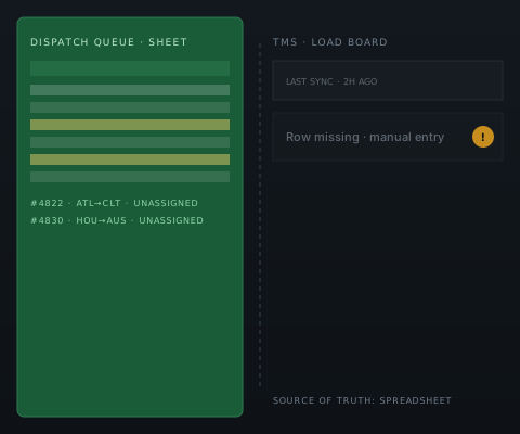
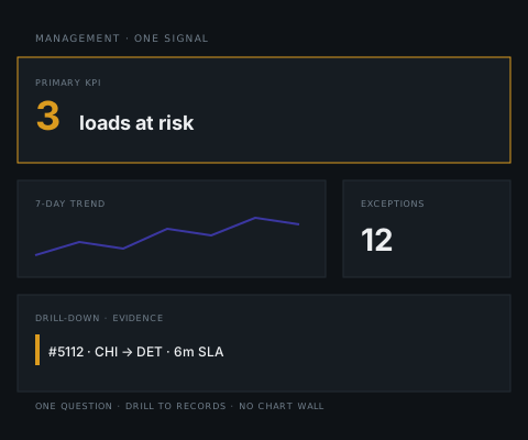
Every dashboard answers one primary question. The signal shows what requires attention. Records provide evidence. Actions let users complete work without leaving the view.
Role-based views
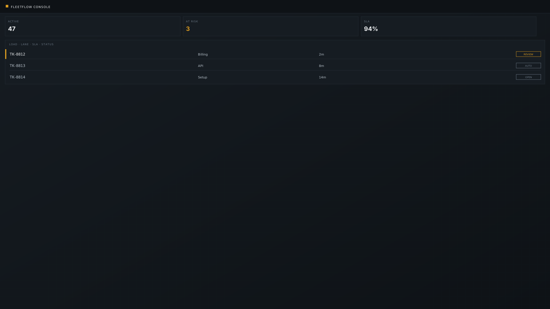
Operations, management, finance, and sales/service teams answer different questions. Hierarchy, KPIs, filters, and actions are shaped to fit - not duplicated across roles.
ShiftRail case study
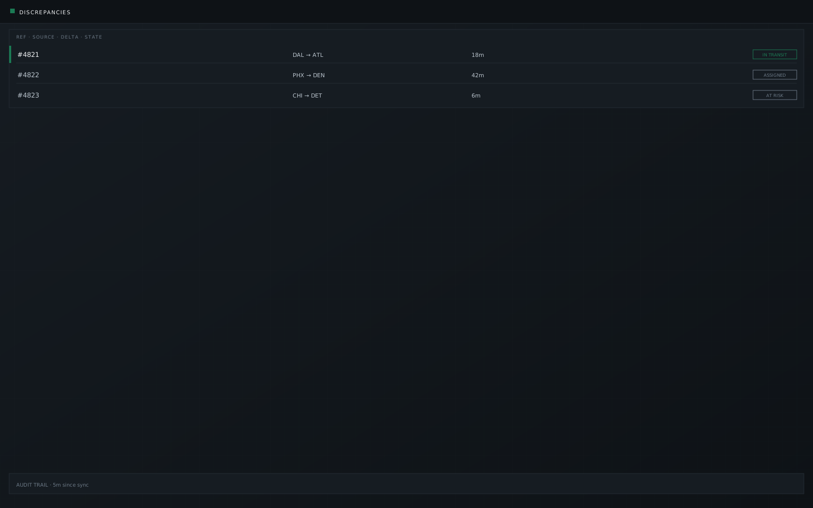
A US trucking dispatch desk running 400+ daily routes rebuilt its morning scan with us - ShiftRail (−32% signed-off manual handle time). Exceptions and at-risk loads above the fold replaced the parallel spreadsheet.
Metrics are signed-off project outcomes from the ShiftRail dispatch engagement. Illustrative UI only - no client data shown.
Queue · by SLA risk
SaaS admin · PayrollPro
B2B SaaS admin and activation surfaces where users stalled after SSO. Role setup waits until after the first payroll cycle. Illustrative interface - no signed-off numeric outcomes. See SaaS product design for multi-tenant scope.
Read the PayrollPro case →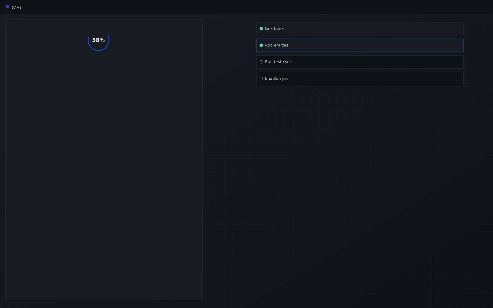
CRMPulse case study
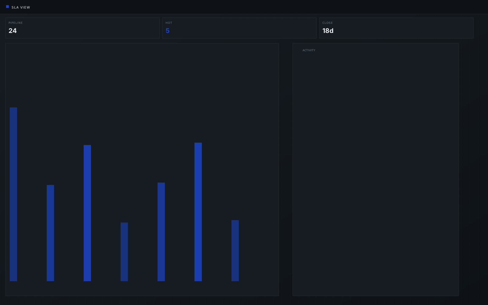
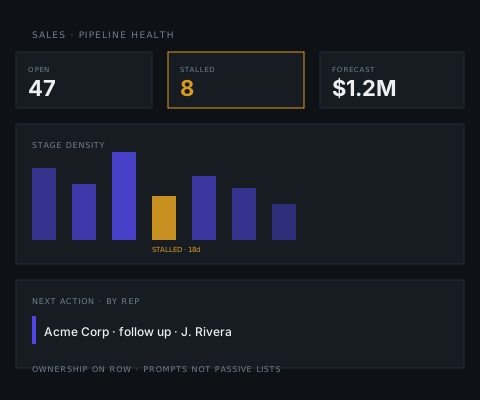
Custom HubSpot pipeline views, stage definitions, and leadership dashboards for a B2B sales team. Illustrative interface - no signed-off numeric outcomes.
Read the CRMPulse case → CRM dashboard UX patterns →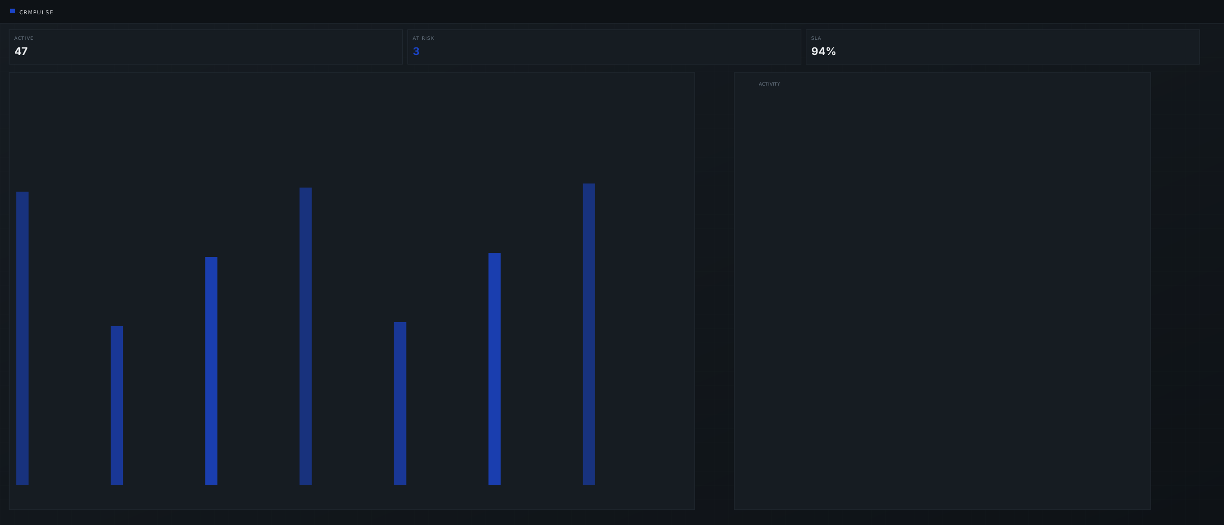
Connected capabilities
Dashboards depend on CRM records, API connectors, and ledger sync behind them.

 QuickBooks & Xero
FAQ
Role hierarchy, data sources, and build scope - before the first call.
Yes - we redesign inside existing products when the architecture allows, without rebuilding the platform from scratch. We assess the workflow first, then recommend hierarchy, data structure, or integration changes.
Yes. CRMs, ERPs, QuickBooks, Xero, TMS, ELD, and internal APIs - with scheduled or near-real-time refresh where the workflow requires it, and visible sync status and error recovery instead of silent failures.
That's the most common engagement. Teams export data because filters, tables, and actions don't match the real workflow. We map the decision first, then design the view that moves users from information to action - ShiftRail's parallel spreadsheet queue was retired after launch.
Yes. Dashboards are built on the records your systems already hold, connected through APIs or the database - with separate views, filters, and actions per role, and audit trails where permissions and overrides need them.
Every dashboard answers one primary question. KPI hierarchy, aggregation layers, and filter design are mapped to the decisions each role makes - not to a generic chart library. If a chart doesn't change a decision, it doesn't sit above the fold.
Designs, code, and documentation transfer to your accounts. Retainer support is optional, with no lock-in. Iteration continues after go-live as the desk uses the board.
Start a conversation
Tell us about the report nobody opens, or the screen where every chart has equal weight. We'll review the workflow and determine whether the problem is hierarchy, data structure, integration, or the surrounding system. No RFP required.
Reply within one business day NDA available No obligation
We will reply within one business day. If you still need a longer brief or a scheduled call, use the contact page.